
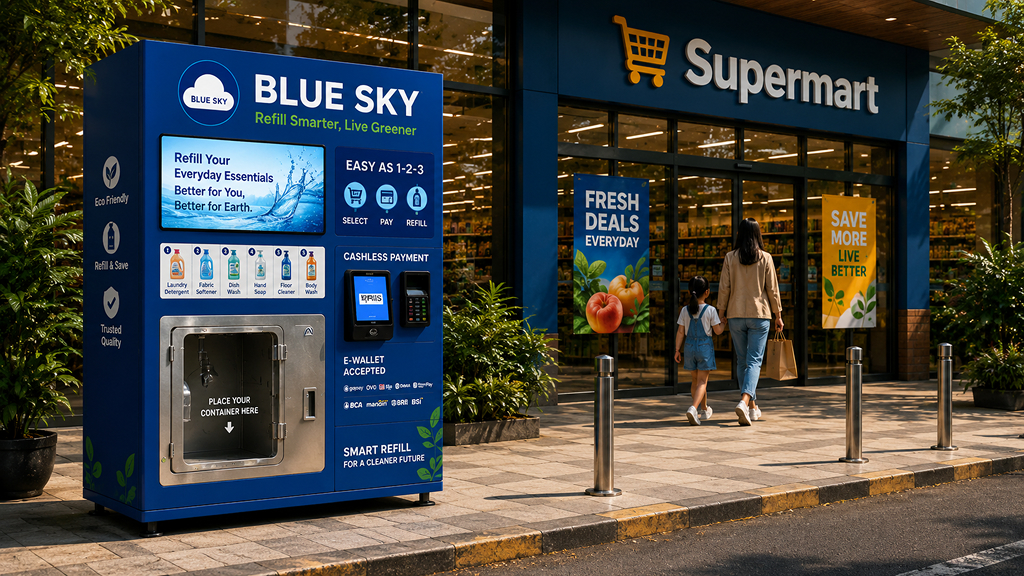
Designed a mobile experience for a household liquid refill service by combining field observation, competitive analysis, and rapid product thinking into an end-to-end customer journey within a five-day design challenge.
01. Project Context
Blue Sky was a take home design assignment for a Senior Product Designer position at Flip.
The challenge was to design a mobile application that guides customers through refilling household liquid products using vending machines located inside supermarkets. Unlike a traditional e-commerce checkout, the experience needed to bridge both digital and physical interactions from selecting products on a phone to completing the refill process at the machine.
With only five days available, I focused on reducing uncertainty by validating assumptions through lightweight research instead of relying solely on intuition.
Understand the context and Define the challenges
Brainstorm the Idea
Designing Solution
Finalize Design & Deck
Project timeline illustrating how the design process was structured within five working days
02. Understanding the Real Experience
Although this project was conceptual, I wanted the solution to be grounded in real-world behavior rather than assumptions.
To better understand how people might interact with a refill service, I visited supermarkets and observed customer behavior around product selection, payment methods, and store layouts.
I also benchmarked experiences beyond vending machines including McDonald’s self-service kiosks, Recharge power bank rental, and Paxel locker services to understand how users interact with touchscreen devices in public spaces.
Instead of asking, “What should the interface look like?”, I focused on understanding:
- Where customers would naturally notice the vending machine
- Which household products people commonly purchase
- Which payment methods already fit everyday habits
- How long the refill process should take before users begin to feel uncertain
These observations helped transform a fictional assignment into a design grounded in realistic assumptions.



Research inputs that helped transform assumptions into evidence-based design decisions.
03. Defining the Design Direction
The research phase revealed four design decisions that shaped the product experience.
The vending machine should be positioned near supermarket entrances or exits where customer visibility is naturally highest.
Rather than overwhelming users with endless choices, the application focuses on common household liquids such as detergent, shampoo, dishwashing liquid, and hand soap across three practical size options.
Since QRIS and e-wallets have become familiar payment methods in Indonesia, the checkout experience prioritizes digital payments to reduce friction at the vending machine.
Testing suggested that refilling a 650 ml bottle would take approximately 30 seconds. Instead of leaving users waiting without context, the application continuously communicates progress throughout the refill process.
04. Designing the Journey
Rather than treating the application as a collection of screens, I designed it as one continuous customer journey.
The experience guides users through:
- Browsing products by brand, variant, and size.
- Completing a cashless payment.
- Receiving clear instructions before refilling.
- Monitoring refill progress in real time.
- Receiving confirmation once the refill is successfully completed.
- Accessing transaction history for future reference.
Every step aims to reduce uncertainty, helping users feel confident as they transition between the digital interface and the physical vending machine.
![[GANTI INI: deskripsi gambar yang informatif]](https://andiastika.com/wp-content/uploads/2026/07/02-UI.png
)
05. Outcome
Although this was a conceptual design challenge, the project strengthened several aspects of my product design process.
Instead of designing purely from imagination, I validated key assumptions through field observations and competitive benchmarking.
The solution focused on the complete service journey, connecting mobile interactions with a physical vending machine experience.
The entire product from research to final presentation was completed within five days while maintaining a structured design process.
While static screens explain the interface, this short walkthrough shows how the experience works in practice.
06. Reflection
This project reminded me that designing for a new product category requires more than creating polished interfaces; it requires reducing uncertainty through research.
Because the assignment lasted only five days, I wasn’t able to validate the solution with real users before submitting it. Looking back, I would dedicate more time to usability testing and prototype validation to understand whether customers could complete the refill journey confidently without assistance.
Another lesson came after the hiring process itself.
Although I reached the final stage, I never received feedback on my submission despite requesting it. That experience reinforced my belief that thoughtful feedback is essential not only for improving design, but also for helping people grow throughout their careers.
Today, whenever I mentor designers or collaborate with teammates, I try to provide constructive feedback whenever possible because I know how valuable it can be.
Want to discuss this project?
I’d love to talk through the process, the decisions, and the lessons learned.