
Redesigning a Banking Registration Journey for More Inclusive Financial Access Removing barriers in digital banking registration through accessibility research, service redesign, and inclusive product thinking.
01. Project Overview
Digital banking has made opening a bank account more convenient for many people. However, convenience is only meaningful when everyone can access it.
As part of the Suarise Digital Accessibility Bootcamp, our team was challenged to evaluate an existing financial product through the lens of digital accessibility. Rather than designing a fictional solution, we selected a real banking registration experience that could create meaningful impact.
After comparing registration journeys across Indonesia’s largest banks, we chose Bank BTN because its onboarding process revealed several opportunities to improve accessibility while preserving existing banking procedures.
Our goal wasn’t simply to redesign the interface.
It was to explore how more people could complete a banking registration independently.
02. Understanding the Real Experience
During our research, our participant shared something that completely changed our perspective.
"I had never opened a bank account independently."
- Tris Munandar
Instead, bank accounts were often registered under someone else’s name because existing registration processes were difficult to complete without assistance.
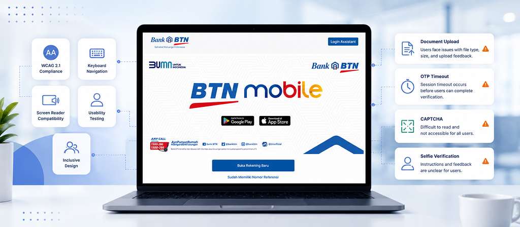
As we observed the registration journey, several barriers became immediately visible.
The existing experience required users to:
Upload a handwritten signature
Capture a properly aligned selfie.
Complete duplicate verification steps.
Navigate a registration flow that wasn’t fully compatible with assistive technologies.
For many users, these interactions may feel routine. For blind users, they become barriers to financial independence.
![[GANTI INI: deskripsi gambar yang informatif]](https://andiastika.com/wp-content/uploads/2026/07/02-BTN-1.jpg)
03. Understanding Real User Needs
Rather than relying solely on accessibility guidelines, we wanted to understand how blind users actually interacted with digital banking services.
Working with Suarise, we conducted multiple remote research sessions with a blind participant based in Yogyakarta.
Several important insights emerged.
Because digital registration wasn’t accessible, independence was limited from the very beginning.
Ongoing weekly sessions with early-career designers on portfolio building, accessibility fundamentals, and navigating design careers in tech.
Without visual feedback, participants couldn’t confidently determine whether their face was positioned correctly.
These insights shifted our design question.
Instead of asking,
"How do we improve the interface?"
we asked,
"How can we preserve the bank's verification process while removing unnecessary barriers?"
04. Accessibility Evaluation
Research alone wasn’t enough.
We complemented user interviews with a structured accessibility audit using WAVE alongside WCAG Level A and Level AA guidelines.
The audit focused on identifying issues affecting both semantic structure and compatibility with assistive technologies.
Rather than treating WCAG as a checklist, we used it to validate observations from user research and prioritize improvements that would have the greatest impact on usability.
Research
WAVE Audit
WCAG Evaluation
Design Opportunities
Accessibility Evaluation Process
05. Design Strategy
Preserve the banking process while removing unnecessary barriers.
One of the most important design decisions wasn’t introducing new technology.
It was respecting how banking verification already works.
Instead of replacing existing operational procedures, we reorganized them into a more accessible journey.
Our redesign focused on four principles.

Users completed identity verification only once instead of repeating similar steps.

Signature upload and selfie capture were removed from self-service registration.

Maintain regulatory compliance
Identity verification continued through an online Customer Service session, mirroring the existing in-branch registration process.

Design for independence
Every design decision aimed to reduce reliance on assistance while preserving security and operational feasibility.
The Redesigned Experience
The new journey simplified registration without compromising regulatory requirements.
- Complete personal information.
- Submit required identity details.
- Schedule an online Customer Service verification.
- Verify identity with assistance from Customer Service.
- Activate the account.
Rather than asking users to overcome inaccessible interactions independently, the redesigned flow shifted verification to a human-assisted step already familiar within banking operations.
This small service redesign created a significantly more inclusive experience.
![[GANTI INI: deskripsi gambar yang informatif]](https://andiastika.com/wp-content/uploads/2026/07/03-BTN-1.jpg)
06. Reflection
Although the project remained conceptual, it demonstrated how accessibility can improve both usability and service design.
The redesigned proposal:
- Reduced duplicate verification steps.
- Removed inaccessible registration interactions.
- Preserved existing banking verification procedures.
- Improved alignment with WCAG recommendations.
More importantly, the project reinforced that accessibility should be considered as part of the overall product and service experience not only during interface design.
And I created a high-fidelity prototype to demonstrate how the redesigned registration journey would work in practice. The walkthrough below illustrates the complete experience from account registration through online identity verification.
Today, whenever I mentor designers or collaborate with teammates, I try to provide constructive feedback whenever possible because I know how valuable it can be.
07. Lessons Learned
This project fundamentally changed how I think about accessibility.
Before joining the bootcamp, I associated accessibility primarily with compliance meeting standards such as WCAG and improving interface quality.
Working directly with a blind participant shifted that perspective.
I realized that accessibility begins long before interface design. It starts with understanding how people navigate everyday tasks, where existing services unintentionally exclude them, and how product decisions can either reinforce or remove those barriers.
Looking back, there are several things I would approach differently today.
I would expand the research beyond a single participant to capture a wider range of accessibility needs, validate the redesigned journey through usability testing, and present the proposal directly to the organization to explore how inclusive design could be adopted in a real banking environment.
Most importantly, this experience reminded me that inclusive design isn’t about designing for a minority.
It’s about removing unnecessary barriers so more people can participate independently.
"Accessibility begins by understanding people, not just following guidelines."
Want to discuss this project?
I’d love to talk through the process, the decisions, and the lessons learned.