
01. The Challenge
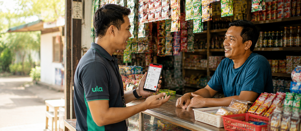
Sales Executives (SEs) at Ula were responsible for visiting and engaging with hundreds of warungs across their assigned districts, not just dropping by, but actively acquiring new stores, recording interactions, collecting feedback, and reporting their daily performance. All of this was done manually: paper lists, handwritten notes, and spreadsheets updated at the end of each day.
The result was slow, error-prone, and gave the business no visibility into what was happening in the field in real time. The Sales App was built to change that.
![[GANTI INI: deskripsi gambar yang informatif]](https://andiastika.com/wp-content/uploads/2026/08/02-Sales-App.jpg)
02. My Role
This was my second project at Ula, following the Retailer App. I joined as the sole designer on this project, working under Product Manager Lead and collaborating closely with a UX Researcher who conducted field research directly with Sales Executives.
My role covered the full design process: translating research findings and product discussions into information architecture, user flows, wireframes, and final UI then working with engineering to ensure the design was implemented correctly.

Insights
Feature prioritization
UI & Flows
Develop based on UI
Research inputs that helped transform assumptions into evidence-based design decisions.
03. Understanding the Problem
Rather than going to the field myself, I worked from a research report produced by the UX Researcher who had interviewed and shadowed Sales Executives directly. Four core problems emerged from that research:
SEs carried printed papers listing stores to visit, with no way to filter or organize by area.
Visit status was recorded on paper or in personal phone notes, then consolidated into a spreadsheet later.
Store feedback was written by hand during visits and transferred to a spreadsheet afterward, creating delays and inaccuracies.
Team Leaders had no way to monitor SE activity during the day; everything was reported after the fact.
04. Shaping the Solution
Improvement directions were defined through discussion with the Product Lead, mapping each problem to a specific in-app solution:
- Centralized, filterable store lists organized by area replaced paper lists
- An in-app visit tracker with sorting and filtering replaced manual note taking
- An in-app notes feature with tags and timestamps replaced handwritten feedback sheets
- A Goal & Achievement dashboard gave Team Leaders real-time visibility into SE performance, acquisition counts, activation targets, and revenue progress
The Information Architecture structured the app into four main areas: Planner, Prospect Customer, Customer, and Performance, each addressing a distinct part of the SE’s daily workflow.
![[GANTI INI: deskripsi gambar yang informatif]](https://andiastika.com/wp-content/uploads/2026/08/05-Sales-App.jpg
)
05. Design
With the structure defined, I moved into UI design by translating each flow into screens that worked for SEs in the field: on the move, often in a hurry, needing quick access to store information and activity logging.
Key screens included the daily Planner with undone and done activity separation, Customer Details with store contact, address, transaction history, and quick action buttons (Visit, Call, Chat, Order), in-app Notes with tagged feedback, and the Goal & Achievement dashboard showing weekly and daily performance metrics.
![[GANTI INI: deskripsi gambar yang informatif]](https://andiastika.com/wp-content/uploads/2026/08/03-Sales-App.png)
![[GANTI INI: deskripsi gambar yang informatif]](https://andiastika.com/wp-content/uploads/2026/08/04-Sales-App.png)
06. Outcome
The Sales App launched as the primary operational tool for approximately 45 Sales Executives across three provinces in Java : West, Central, and East Java, replacing a process that had relied entirely on paper and spreadsheets.
Post release usability testing identified three areas for further improvement: route planning (SEs couldn’t sort stores by distance), store data accuracy (incomplete addresses and missing photos), and duplicate customer accounts affecting performance tracking. These findings were documented and handed over as the basis for the next iteration.
Although I moved to a different tribe before the follow-up improvements were completed, the overall feedback after the first release confirmed a meaningful operational shift: for the first time, Team Leaders could monitor SE activity in real time instead of waiting for end-of-day spreadsheet updates.
07. Reflection
Designing the Sales App taught me that good field tools are defined by constraint. SEs aren’t sitting at desks, they’re moving between stores, under time pressure, with one hand sometimes occupied. Every interaction needed to be fast, recoverable, and forgiving of mistakes.
Working from a UX research report rather than conducting field visits myself also shaped how I approached the design. It reinforced the importance of reading research carefully, not just the findings, but the context and nuances behind them and translating that into design decisions the researcher and PM could both recognize as faithful to what users actually needed.
What I would do differently: I would have pushed earlier for a route planning feature, as this turned out to be the most immediate friction point for SEs after launch. In hindsight, sorting stores by distance was a core workflow need, not a nice-to-have enhancement.
Want to discuss this project?
I’d love to talk through the process, the decisions, and the lessons learned.